In the spring of 2020, every household in the UK was sent a six page leaflet from the government about how to stop the spread of coronavirus. I was struck by how the infographics failed to communicate clearly and I set myself the brief to communicate the same messages with more clarity and engagement.
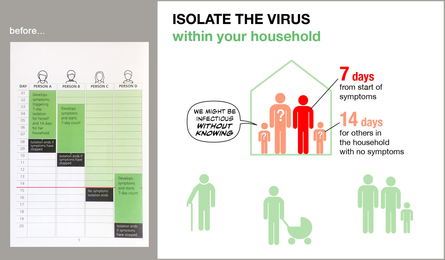
I had to read the Government page on the left three times before I understood what it was saying.
In contrast, my version on the right:
In contrast, my version on the right:
- takes into account the breadth of the audience and aims to communicate with those that might be hard to reach
- aims to communicate in under 5 seconds to the majority who 'skim-read' leaflets like this
- reduces the amount of text and uses graphics to convey information instead, where possible
- focuses on the most important behaviours (who has to isolate for 7 days and who for 14 days), rather than trying to cover every eventuality
- uses illustration to tell a story rather than just as decoration (eg the depiction of vulnerable older person and baby outside the house). Humans are wired to engage with stories
- red is generally associated with importance, emergency and danger
- uses illustrations that are gender and race-neutral
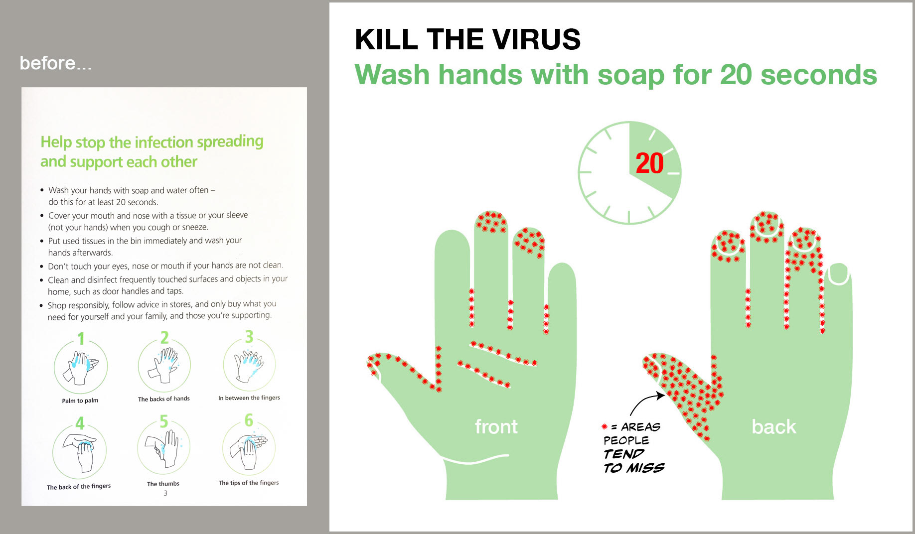
I suspect that few people will carefully follow the instructions in the hand-washing graphic on the government leaflet to the left. In contrast, my version on the right:
- focuses on the most important behaviours (thoroughness and time taken), rather than giving too much detail
- uses illustration to generate curiosity and engagement
- red spots are associated with germs and infection
- uses illustrations that are gender and race-neutral
You're welcome to use and download the graphics in this article but please acknowledge the source as www.lesagedesign.co.uk